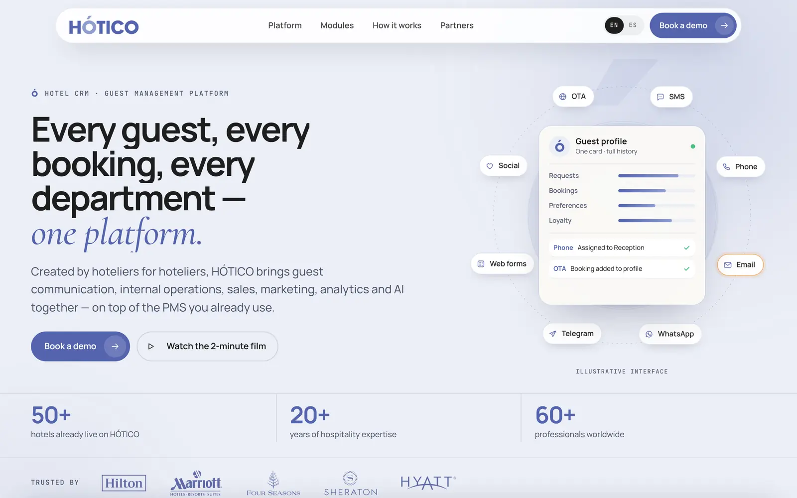
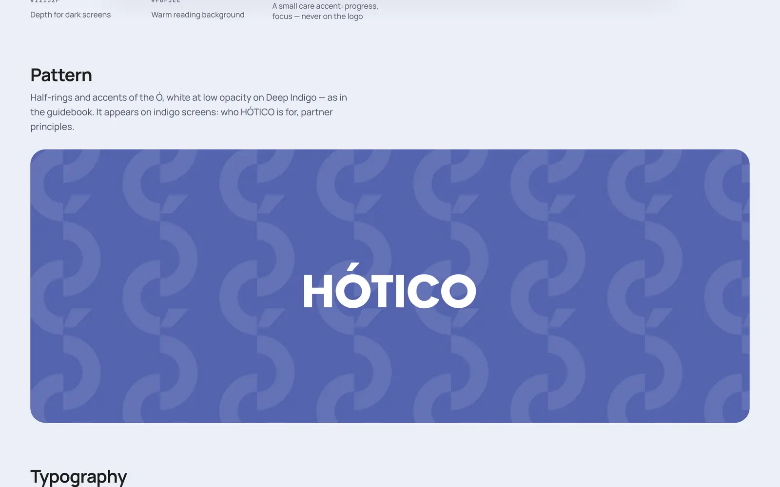
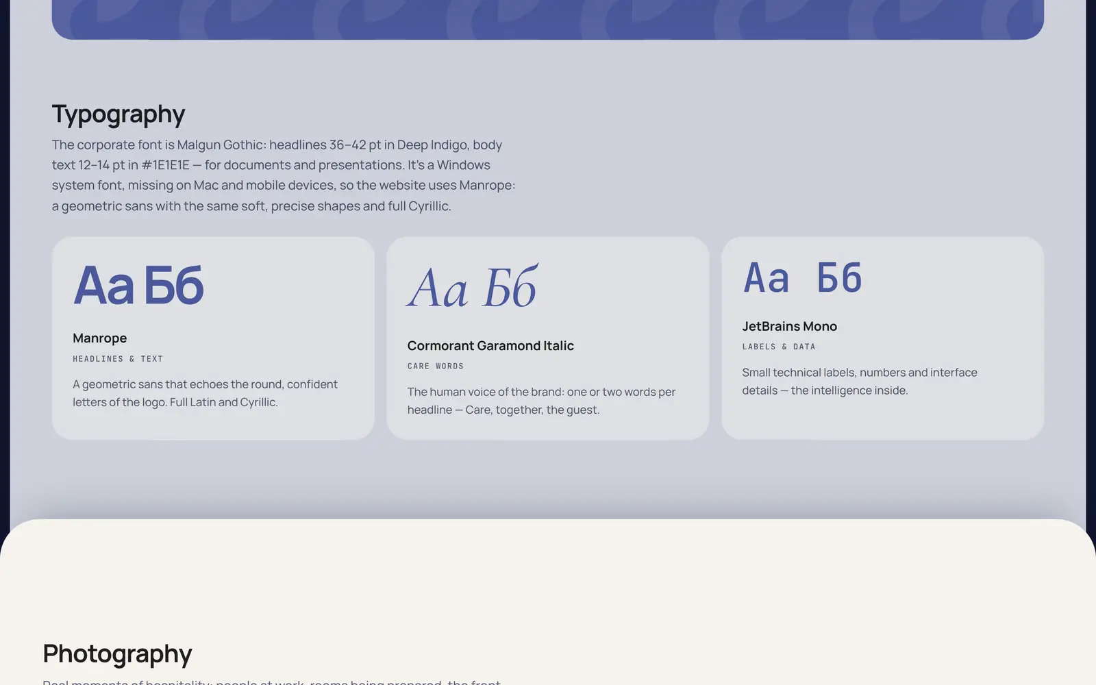
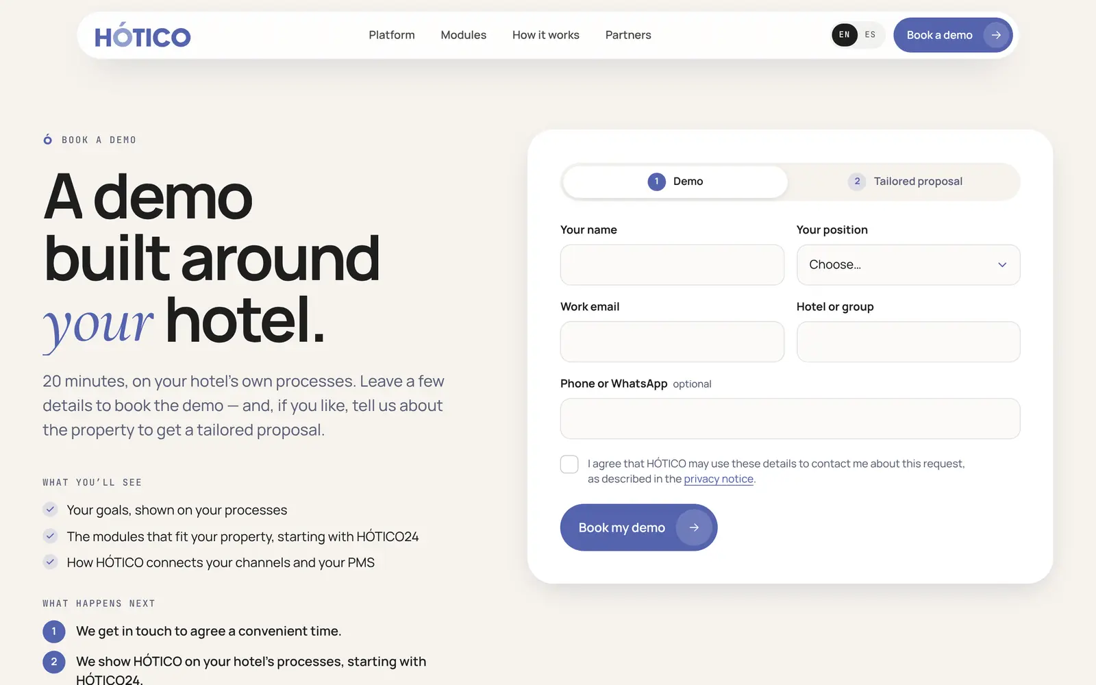
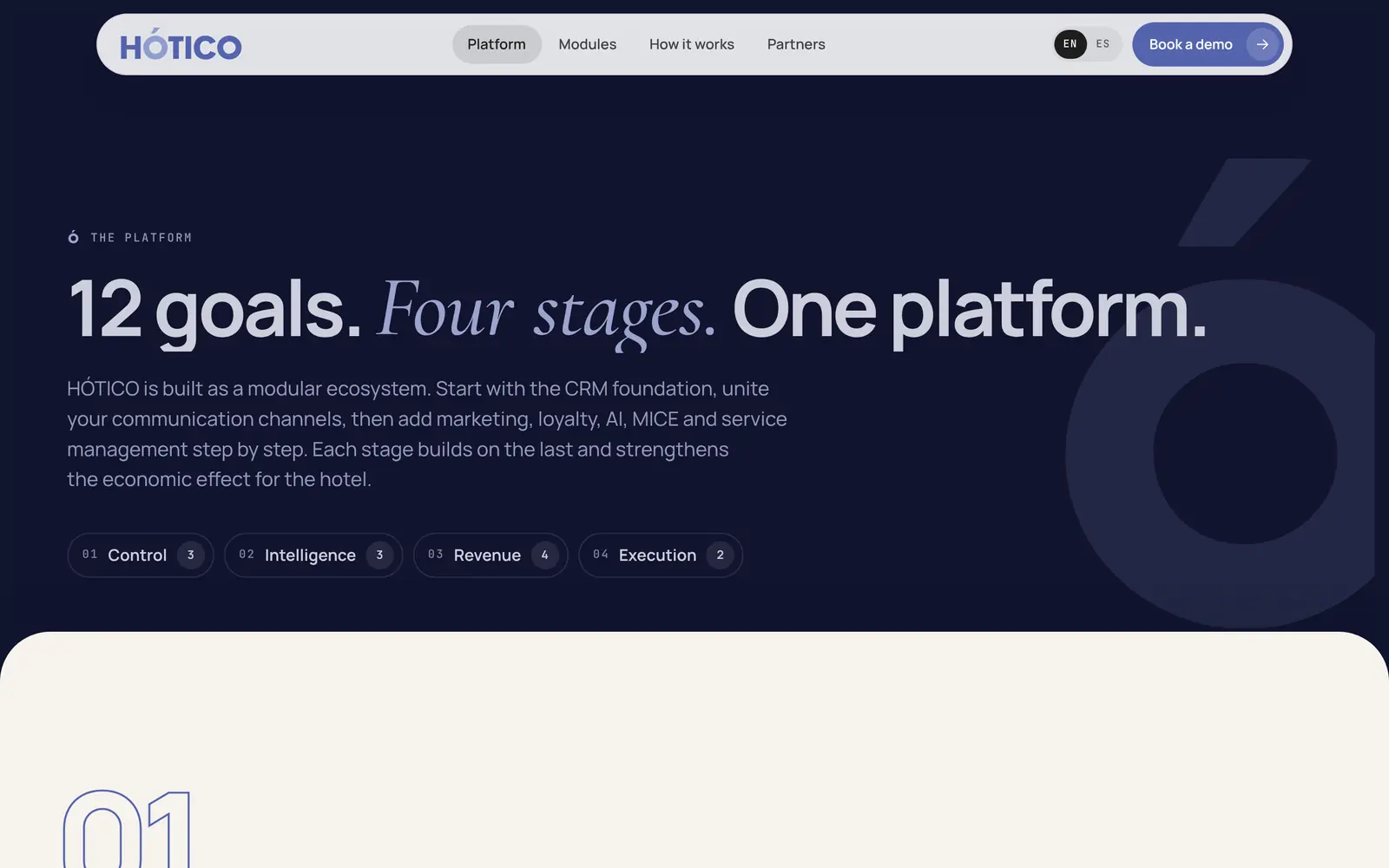
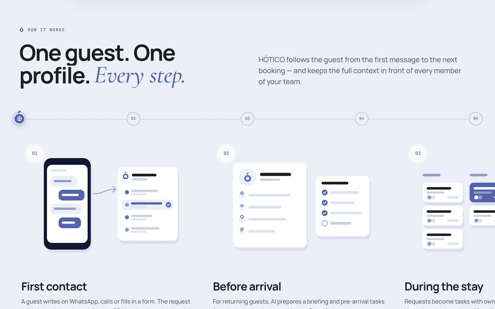
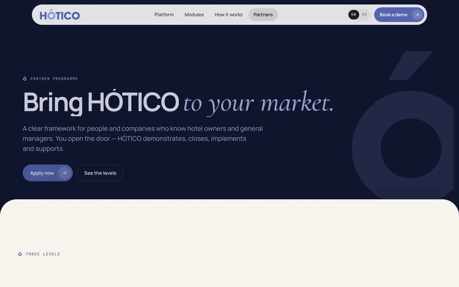
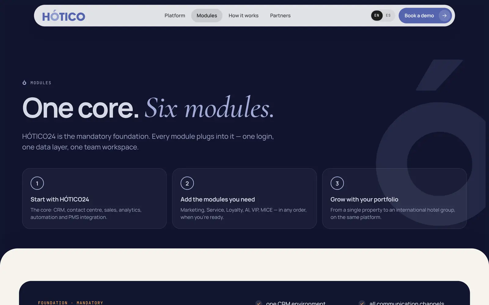
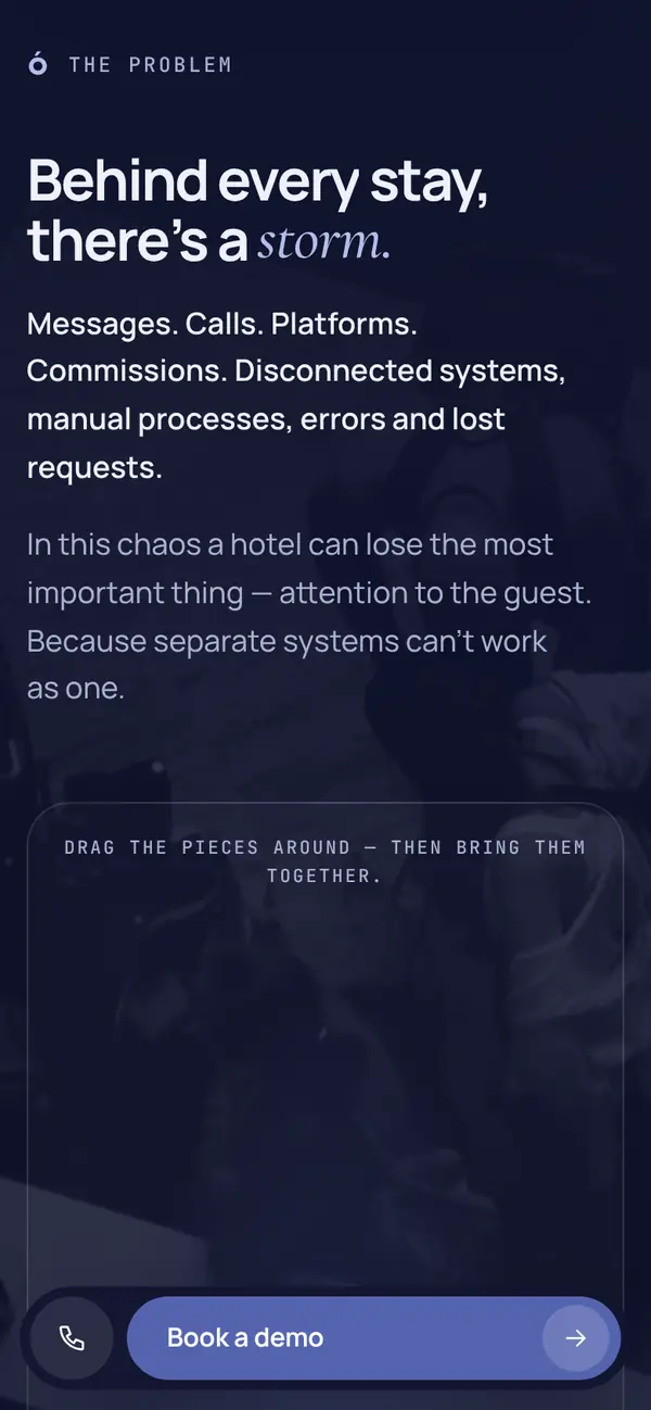
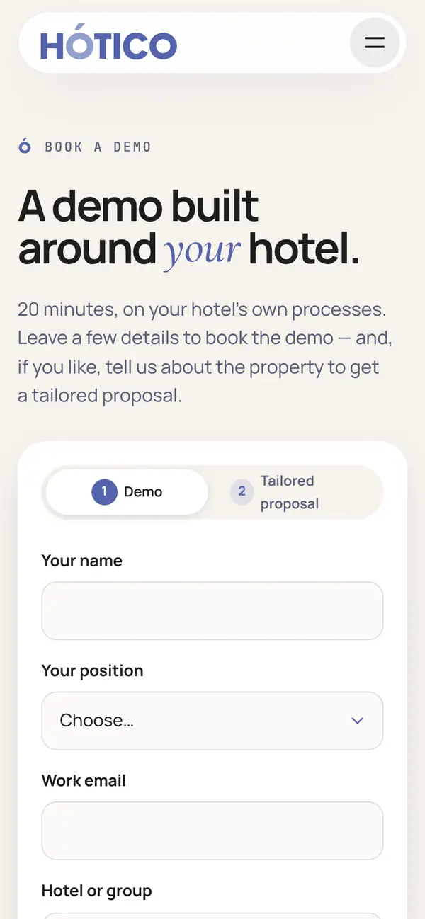
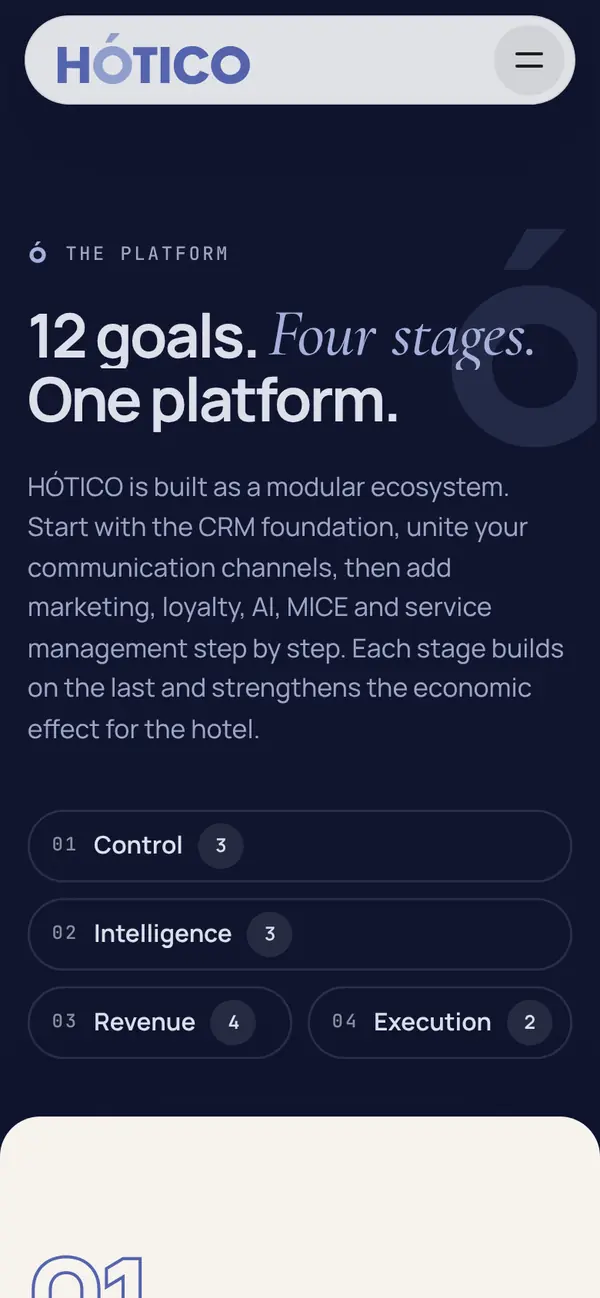
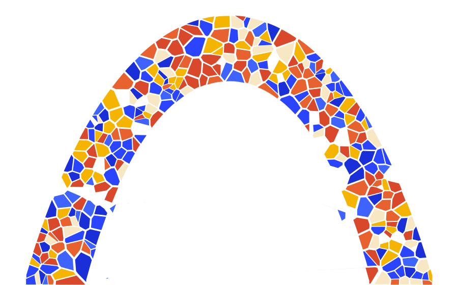
The ring of the Ó is the guest’s 360° journey, and the accent above it is the care HÓTICO adds. The Ó becomes the symbol: the icon, the loader, the progress, the guest moving through the journey.
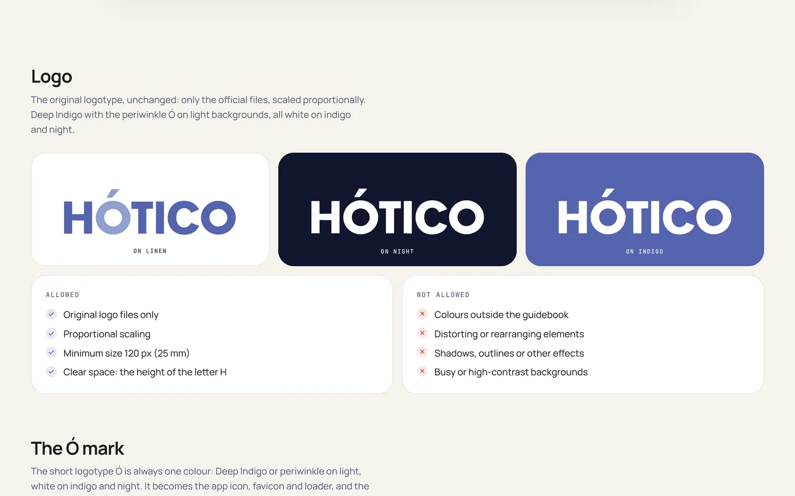
- Logo
- The original logotype, unchanged: Deep Indigo with the periwinkle Ó on light grounds, all white on indigo and Night
- The Ó
- Always one colour. It becomes the app icon, the favicon, the loader and the marker before headings
- Photography
- Real moments of hospitality, licensed from Unsplash, in one house grade: muted colour, indigo in the shadows, warm light kept
- Motion
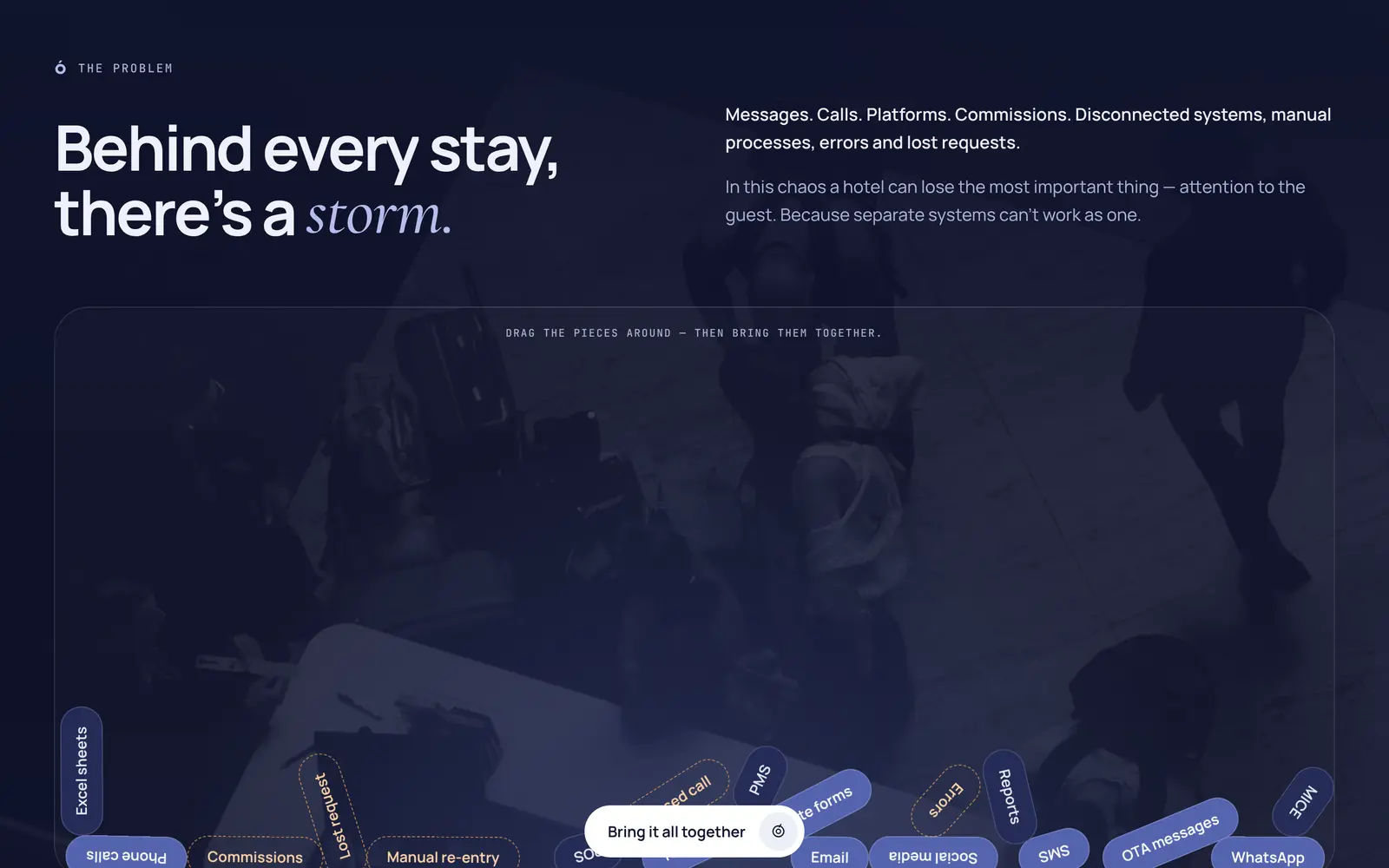
- From storm to order: things arrive scattered and settle into one ring. A pill header, sheet transitions and an iris between pages, all off under reduced motion
- Pattern
- Half-rings and accents of the Ó, white at low opacity on Deep Indigo, as in the guidebook
- Voice
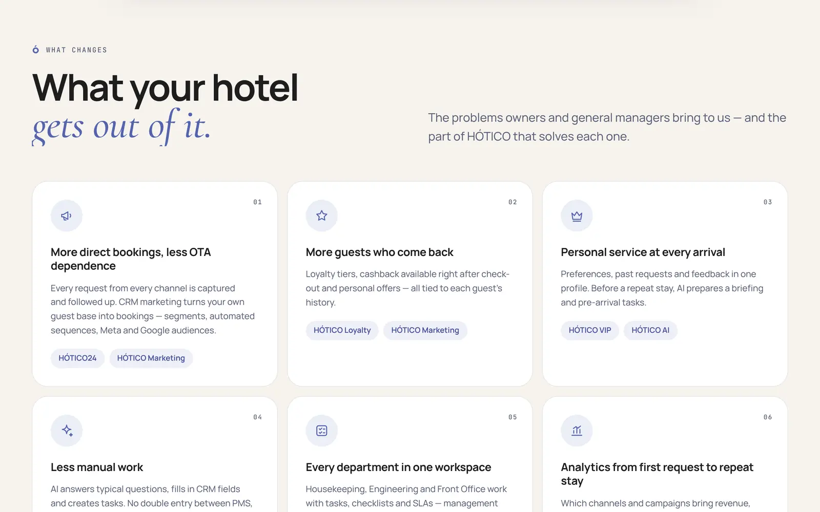
- Warm, not sugary; clear, not technical. Care, backed by concrete features